import pandas as pd
import numpy as np
import matplotlib.pyplot as plt
import seaborn as sns
import altair as alt
Download data here: aiddata.csv
Data import and basic manipulation #
df = pd.read_csv('../static/files/aiddata.csv')
# df.head()
# don't actually need the first two columns:
df = df.iloc[:, 2:]

# rename the columns
df.columns = ['year', 'donor', 'recipient', 'amount', 'purpose_code', 'purpose_name']
# df.head()
# check the shape
df.shape

# close to 10K rows!
(98540, 6)
# check year range

min(df.year), max(df.year)
(1973, 2013)
Task 1 #
The first task is: for each country or region, visualize the difference between its donation and receiving, for each year. To do that, we need a dataframe that has these three columns:
- year
- country/region name
- donation
- receiving
- difference
Then, we can visualize the difference by year for each country or region (hereafter referred as “country”).
There are two obvious challenges:
- Right now, each row lists a donation-receiving pair. But what we want is: for each year, what’s the amount of donation and receiving this country has.
- Not all countries appeared in all years.
Let’s first get donation and receiving data from the source data.
def parse_donation_and_receiving(df, var):
    """
    To get donationn or receiving data from df

    Input:
        - df: df
        - var: either 'donor' or 'recipient'

    Return:
        a dataframe
    """
    data = []
    for group in df.groupby(['year', var]):
        # total amount of donation or receiving in that year for this country
        total_amount = group[1].amount.sum()
        # the amount is so big, we use the unit of billio (10**9)
        total_amount = total_amount / 10**9
        data.append((
            # year:
            group[0][0],
            # country:
            group[0][1],
            # amount:
            total_amount
        ))
    var_name = 'donation' if var == 'donor' else 'received'
    data_df = pd.DataFrame(
        data, columns = ['year', 'country', var_name]
    )
    return data_df
# We first get the donation data
donation_df = parse_donation_and_receiving(df, 'donor')
donation_df.head()| year | country | donation | |
|---|---|---|---|
| 0 | 1973 | Australia | 0.046286 |
| 1 | 1973 | Belgium | 0.039251 |
| 2 | 1973 | Canada | 0.437928 |
| 3 | 1973 | France | 0.247190 |
| 4 | 1973 | Germany | 0.562232 |
# Then we get the receiving data
receiving_df = parse_donation_and_receiving(df, 'recipient')
receiving_df.head()| year | country | received | |
|---|---|---|---|
| 0 | 1973 | Brazil | 0.312075 |
| 1 | 1973 | Chile | 0.088056 |
| 2 | 1973 | Colombia | 0.549945 |
| 3 | 1973 | Cyprus | 0.009613 |
| 4 | 1973 | India | 2.285257 |
First, let’s look at how many countries are there:
all_cntry = list(df.donor) + list(df.recipient)
all_cntry = list(set(all_cntry))

# there are in total 47 unique countries
len(all_cntry)
47
We have 47 unique countries, but the problem is, in some years, not all countries are present, for example, in receiving_df, only 10 countries were present in the year of 1973.
receiving_df[receiving_df.year == 1973]| year | country | received | |
|---|---|---|---|
| 0 | 1973 | Brazil | 0.312075 |
| 1 | 1973 | Chile | 0.088056 |
| 2 | 1973 | Colombia | 0.549945 |
| 3 | 1973 | Cyprus | 0.009613 |
| 4 | 1973 | India | 2.285257 |
| 5 | 1973 | Korea | 1.363707 |
| 6 | 1973 | Kuwait | 0.000325 |
| 7 | 1973 | Saudi Arabia | 0.000065 |
| 8 | 1973 | Thailand | 0.206363 |
| 9 | 1973 | United Arab Emirates | 0.000065 |
# same issue for donation data
donation_df[donation_df.year == 1973]| year | country | donation | |
|---|---|---|---|
| 0 | 1973 | Australia | 0.046286 |
| 1 | 1973 | Belgium | 0.039251 |
| 2 | 1973 | Canada | 0.437928 |
| 3 | 1973 | France | 0.247190 |
| 4 | 1973 | Germany | 0.562232 |
| 5 | 1973 | Italy | 0.166719 |
| 6 | 1973 | Japan | 0.938966 |
| 7 | 1973 | Netherlands | 0.162751 |
| 8 | 1973 | Norway | 0.035875 |
| 9 | 1973 | Sweden | 0.168369 |
| 10 | 1973 | Switzerland | 0.014061 |
| 11 | 1973 | United Kingdom | 0.442579 |
| 12 | 1973 | United States | 1.553264 |
You might ask: what will be the issue if not all countries are in each year. Good question! The issue is that if we do not have data for all countries each year, we are not able to get the difference between donation and receiving for each country in each year very easily. To do that, we need to “normalize” the time. If a country does not appear in a year, that means it does not recieve (or donate) any money in that year.
This is how I solved the problem:
def normalize_time(data, all_cntry, var_name):
    """normlize time for donation_df and receiving_df

    Input:
        - data: either donation_df or receiving_df
        - all_cntry
        - var_name: either 'donation' or 'received'

    Output:
        - a dataframe
    """
    dfs = []
    for group in data.groupby('year'):
        year = group[0]
        present_cntry = group[1].country.tolist()
        absent_cntry = [x for x in all_cntry if x not in present_cntry]
        absent_df = pd.DataFrame({
            'year': year,
            'country': absent_cntry,
            var_name: 0
        })
        dff = pd.concat([group[1], absent_df], ignore_index = True)

        # by sorting the country, we make sure that rows in the output
        # donation and receiving dataframes correspond to each other
        dff.sort_values(by='country', ascending=True, inplace=True)
        dfs.append(dff)

    data_df = pd.concat(dfs, ignore_index = True)
    return data_df
donation = normalize_time(donation_df, all_cntry, var_name = 'donation')
donation.head()| year | country | donation | |
|---|---|---|---|
| 0 | 1973 | Australia | 0.046286 |
| 1 | 1973 | Austria | 0.000000 |
| 2 | 1973 | Belgium | 0.039251 |
| 3 | 1973 | Brazil | 0.000000 |
| 4 | 1973 | Canada | 0.437928 |
receiving = normalize_time(receiving_df, all_cntry, var_name = 'received')
receiving.head()| year | country | received | |
|---|---|---|---|
| 0 | 1973 | Australia | 0.000000 |
| 1 | 1973 | Austria | 0.000000 |
| 2 | 1973 | Belgium | 0.000000 |
| 3 | 1973 | Brazil | 0.312075 |
| 4 | 1973 | Canada | 0.000000 |
# to check whether the countries in the two lists are the same
r_c = list(set(receiving.country))
d_c = list(set(donation.country))
r_c == d_c
True
Then we combine the two datasets and calculate the difference:
all_df = donation
all_df['received'] = receiving['received']
all_df['d_minus_r'] = all_df['donation'] - all_df['received']
all_df.head()| year | country | donation | received | d_minus_r | |
|---|---|---|---|---|---|
| 0 | 1973 | Australia | 0.046286 | 0.000000 | 0.046286 |
| 1 | 1973 | Austria | 0.000000 | 0.000000 | 0.000000 |
| 2 | 1973 | Belgium | 0.039251 | 0.000000 | 0.039251 |
| 3 | 1973 | Brazil | 0.000000 | 0.312075 | -0.312075 |
| 4 | 1973 | Canada | 0.437928 | 0.000000 | 0.437928 |
all_df.shape(1927, 5)
To make the plot, we need to transform the format of year:
all_df['year'] = pd.to_datetime(all_df['year'], format='%Y')alt.Chart(all_df).mark_line().encode(
x = alt.X(
'year',
title = 'Year'
),
y = alt.Y(
'd_minus_r:Q',
title = 'Donation - Received',
axis=alt.Axis(
titleColor='#5276A7',
labelExpr = 'datum.value + "B `$"'
),
),
facet = alt.Facet(
"country:N",
columns = 8,
title = 'Country/Region',
header = alt.Header(labelFontSize = 12)
)
).properties(
width = 120,
height = 110,
).configure_header(
titleColor='#5276A7',
titleFontSize=16,
# labelColor='red',
labelFontSize=14
)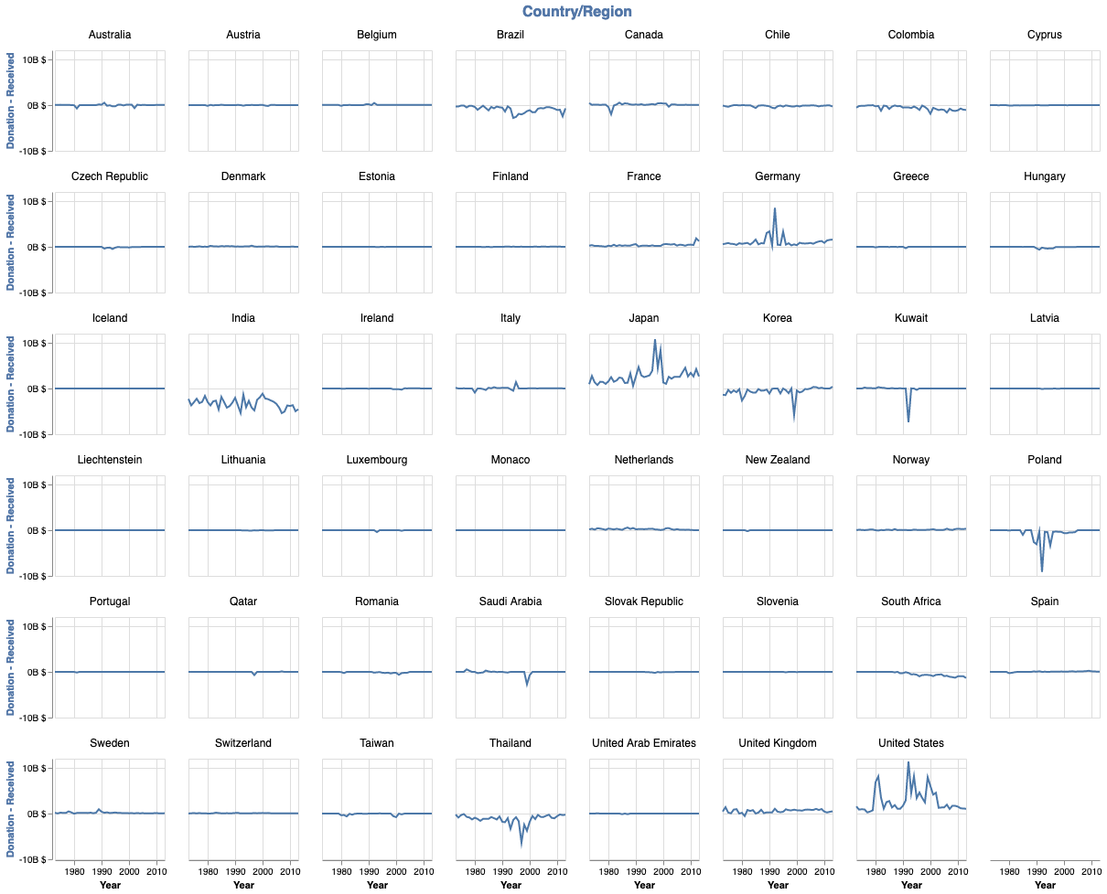
The problem with this plot is that with it, we are not able to see the actual donation and receiving. We can achieve this in the following way.
all_df_melted = pd.melt(all_df,
        id_vars=['year', 'country'],
        value_vars=['donation', 'received'],
        var_name = 'category',
        value_name = 'amount'
       )
all_df_melted.replace({
    'donation': 'Donation',
    'received': 'Received'
}, inplace = True)
all_df_melted.rename(
    columns = {
        'category': 'Category'
    }, inplace = True)
all_df_melted.head()| year | country | Category | amount | |
|---|---|---|---|---|
| 0 | 1973-01-01 | Australia | Donation | 0.046286 |
| 1 | 1973-01-01 | Austria | Donation | 0.000000 |
| 2 | 1973-01-01 | Belgium | Donation | 0.039251 |
| 3 | 1973-01-01 | Brazil | Donation | 0.000000 |
| 4 | 1973-01-01 | Canada | Donation | 0.437928 |
This is important: because we are going to plot both donaiton and received amount each year for each country, it is important to replace 0 with NaN. Because the figures will be very small, if we do not change 0 to NaN, then we will consider 0 as small amount of donation or received amount, which is misleading.
all_df_melted['amount'] = all_df_melted['amount'].replace(0, np.nan)
all_df_melted.head()| year | country | Category | amount | |
|---|---|---|---|---|
| 0 | 1973-01-01 | Australia | Donation | 0.046286 |
| 1 | 1973-01-01 | Austria | Donation | NaN |
| 2 | 1973-01-01 | Belgium | Donation | 0.039251 |
| 3 | 1973-01-01 | Brazil | Donation | NaN |
| 4 | 1973-01-01 | Canada | Donation | 0.437928 |
alt.Chart(all_df_melted).mark_line().encode(
    x = alt.X(
        'year',
        title = 'Year'
    ),
    y = alt.Y(
        'amount:Q',
        title = 'Amount',
        axis=alt.Axis(
            titleColor='#5276A7',
            labelExpr = 'datum.value + "B $`"'
        ),
    ),
    color = alt.Color(
        'Category:N',
    ),
    facet = alt.Facet(
        "country:N",
        columns = 8,
        title = 'Country/Region',
        header = alt.Header(labelFontSize = 12)
    )
).properties(
    width = 120,
    height = 110,
).configure_header(
    titleColor='#5276A7',
    titleFontSize=16,
#     labelColor='red',
    labelFontSize=14
)
Task 2 #
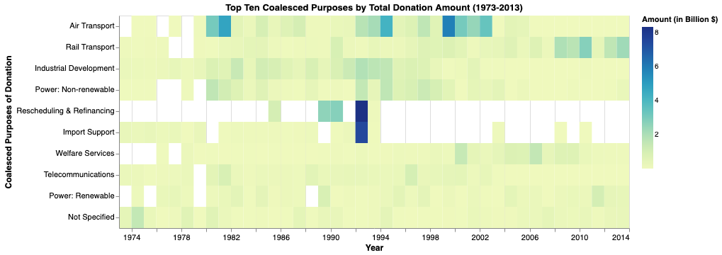
The second task is: find the top 10 coalesced purposes (according to the amount of donation) and for these ten purposes, show how their amount changes by time.
# First, find the top ten purposes
top_purpose_df = df.groupby('purpose_name')['amount'].agg('sum').nlargest(n=10)
top_10_purposes = list(top_purpose_df.index)
top_10_purposes
['Air transport',
'Rail transport',
'Industrial development',
'Power generation/non-renewable sources',
'RESCHEDULING AND REFINANCING',
'Import support (capital goods)',
'Social/ welfare services',
'Telecommunications',
'Power generation/renewable sources',
'Sectors not specified']
# Then select only data involving these top purposes
# We only want three columns: year, amount, and purpose name
purpose_df = df[df.purpose_name.isin(top_10_purposes)][['year', 'amount', 'purpose_name']]
# So many rows:
purpose_df.shape
(17793, 3)
purpose_df.head()| year | amount | purpose_name | |
|---|---|---|---|
| 0 | 1977 | 348718518.0 | Power generation/renewable sources |
| 2 | 1983 | 79371799.0 | Rail transport |
| 3 | 1984 | 212202942.0 | Rail transport |
| 11 | 1976 | 193588873.0 | Power generation/renewable sources |
| 19 | 1986 | 53561256.0 | Power generation/renewable sources |
# For each purpose, we calculate the yearly sum:
purpose_dfs = []
for group in purpose_df.groupby('purpose_name'):
    purpose_name = group[0]
    group_df = group[1].groupby('year')['amount'].sum().to_frame()
    group_df.reset_index(inplace=True)
    group_df['purpose_name'] = group[0]
    purpose_dfs.append(group_df)
purpose = pd.concat(purpose_dfs, ignore_index = True)
purpose.head()| year | amount | purpose_name | |
|---|---|---|---|
| 0 | 1974 | 1.525672e+07 | Air transport |
| 1 | 1975 | 1.582943e+07 | Air transport |
| 2 | 1977 | 7.046280e+05 | Air transport |
| 3 | 1979 | 7.342023e+07 | Air transport |
| 4 | 1980 | 3.088275e+09 | Air transport |
purpose.shape(338, 3)
# change amount to the unit of billion
purpose['amount'] = purpose['amount'] / 10**9

# # change the format to be year
purpose['year'] = pd.to_datetime(purpose['year'], format='%Y')max(purpose.amount)8.344866729
# to change the purpose name
purpose_renamer_dic = {'Air transport': 'Air Transport',
 'Rail transport': 'Rail Transport',
 'Industrial development': 'Industrial Development',
 'Power generation/non-renewable sources': 'Power: Non-renewable',
 'RESCHEDULING AND REFINANCING': 'Rescheduling & Refinancing',
 'Import support (capital goods)': 'Import Support',
 'Social/ welfare services': 'Welfare Services',
 'Telecommunications': 'Telecommunications',
 'Power generation/renewable sources': 'Power: Renewable',
 'Sectors not specified': 'Not Specified'
 }
purpose.replace(purpose_renamer_dic, inplace = True)# make the plot
alt.Chart(purpose).mark_line().encode(
x = 'year',
y = 'amount',
color = 'purpose_name',
strokeDash = 'purpose_name'
)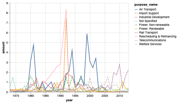
The problem with this chart is that it is so messy. We can visualize it in another way:
alt.Chart(purpose).mark_rect().encode(
    x = alt.X(
        'year(year)',
        title = 'Year'
    ),
    y = alt.Y(
        'purpose_name:N',
        title = 'Coalesced Purposes of Donation',
        sort=alt.EncodingSortField(field='amount', op='sum', order='descending')
    ),
    color = alt.Color(
        'amount:Q',
        title = 'Amount (in Billion $`)',
    )
).properties(
    width = 720,
    height = 300,
    title = 'Top Ten Coalesced Purposes by Total Donation Amount (1973-2013)',
).configure_axis(
    labelFontSize=11,
    titleFontSize=12
)
Last modified on 2025-07-02 • Suggest an edit of this page