The R package igraph is very useful. However, its degree() and degree_distribution() function is not so straightforward. Also, it might be challenging to plot degree distribution.
Getting a deeper understanding of degree() and degree_distribution()
To explore these two function, let’s first draw a simple network.
library(igraph)g1 <- graph( edges=c(1,2, 1,3, 2,3, 3,4), n=4, directed=FALSE)
plot(g1)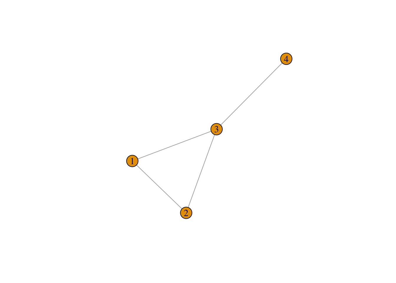
Figure 1: A simple network, g1
Okay, now let’s have a look at its nodes’ degrees and its degree distribution.
deg_1 <- degree(g1)
deg_1
## [1] 2 2 3 1But does this result mean? It means that the degree of node1 is \(2\), the degree of node2 is \(2\), the degree of node3 is \(3\), and the degree of node4 is \(1\).
Okay. Let’s have a look at g1’s degree distribution:
degree_distribution(g1)## [1] 0.00 0.25 0.50 0.25What does this result mean then? Does it stand for the value of node \(1-4\). No. It means the relative frequency of all the degrees, i.e., \(1, 2, 3\), as is shown in the result of degree(g1). Wait, but there are four values in the result above, \(0.00, 0.25, 0.50, 0.25\). Well, this is because the first value is for degree \(0\).
Conclusion: degree() will tell us the degree of all the nodes. degree_distribution() will tell us the relative frequency of all the degrees.
Then, we may wonder, what if we don’t have all the degrees from the minimum to maximum. For example, if we only have degrees of \(1,2,4,9\), will the degree_distribution() function show us the relative frequency of degree \(5\) (which should be zero)?
Let’s try.
set.seed(1234)
g2 <- graph( edges=c(1,2, 1,3, 2,3, 3,4, 4,5, 4,6, 4,7,
                     4,8, 4,9, 4,10, 3,11, 2,12,
                     4,13, 4,14, 2,15, 6,12, 7,10),
             n=15, directed=FALSE)
plot(g2)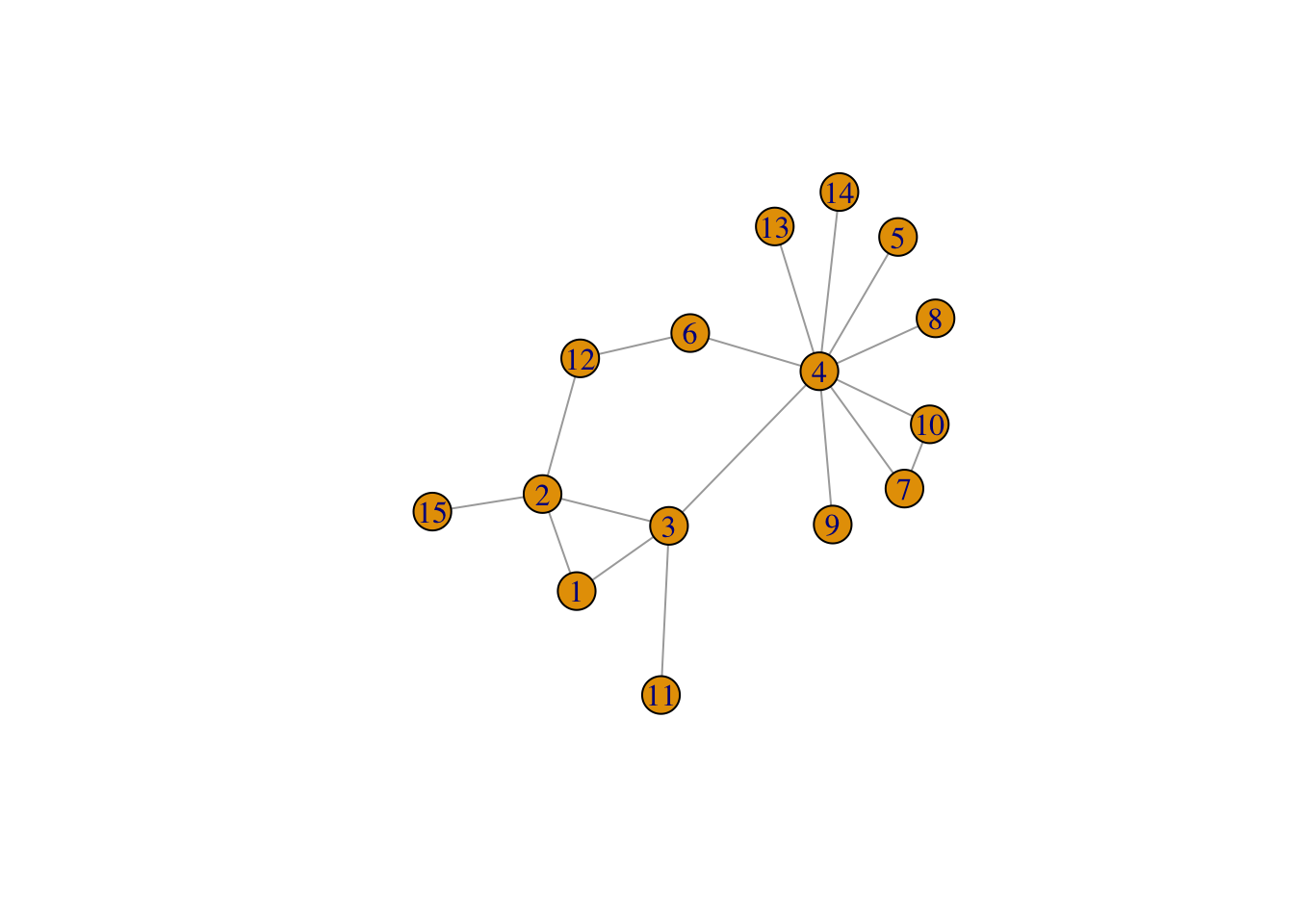
Figure 2: Another simple network, g2
deg_2 <- degree(g2)
deg_2
## [1] 2 4 4 9 1 2 2 1 1 2 1 2 1 1 1degree_distribution(g2)## [1] 0.00000000 0.46666667 0.33333333 0.00000000 0.13333333 0.00000000
## [7] 0.00000000 0.00000000 0.00000000 0.06666667As we can see above, yes, it will. It displays relative frequencies for all possible degrees from \(0\) to \(9\).
Plotting the distribution
Let’s plot it.
First, you might be thinking of histogram:
hist(degree(g1),
     xlab = "k",
     ylab = "Frequency",
     main = "Histogram of g1's nodes degrees, without adjusting breaks and ylim",
     col = "skyblue")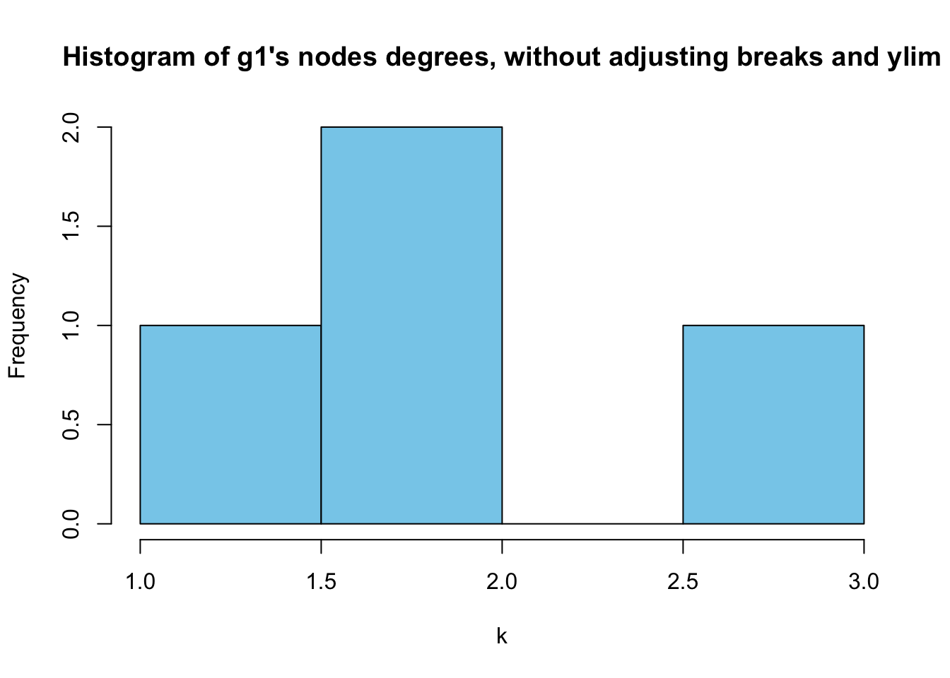
However,as we can ses above, it doesn’t make much sense because all of the degrees are discrete numbers. Let’s try bar plot instead.
t1 <- table (deg_1)
sum(t1)
## [1] 4relafreq_1 <- t1/sum(t1)
barplot(relafreq_1, xlab = "k", ylab = "Relative frequencies",
main = "Degree distribution of g1, without adjusting ylim",
col = "orange")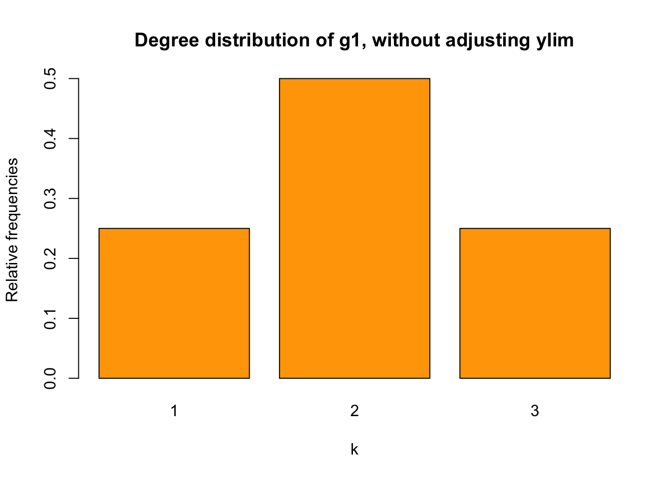
It works.
Let’s plot g2 as well.
t2 <- table (deg_2)
sum(t2)
## [1] 15relafreq_2 <- t2/sum(t2)
barplot(relafreq_2, xlab = "k", ylab = "Relative frequencies",
main ="Degree distribution of g2, without adjusting ylim",
col = "orange")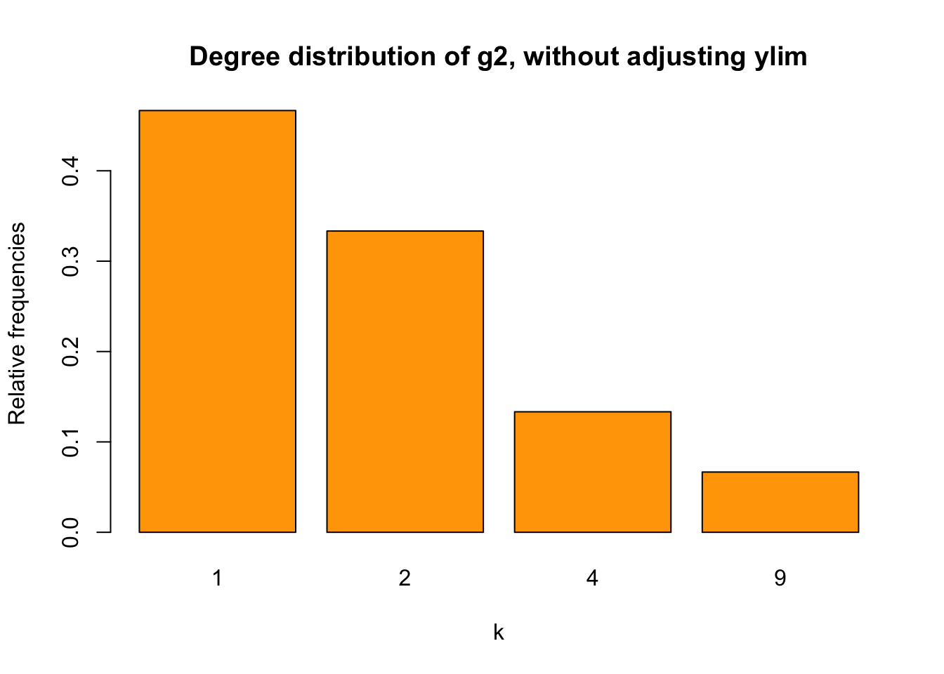
Figure 3: bar chart for g2 without adusting ylim
We find that the Y-axis scale is too short for our values. I found a solution here. Before looking at the solution, let’s first try solving it by ourselves.
What’s the problem here? The problem is that the Y-axis scale is too short. To adjust Y-axis scale, let’s try ylim first.
What do we need to set ylim? As sebkopf noted here on stackoverflow, we simply need to set the minimum and maximum values using, for example, c().
Naturally, we may think of max(). Let’s try:
barplot(relafreq_2, xlab="k", ylab = "Relative frequencies",
        main="Degree distribution of g2, adjusting ylim using `c(0,max())`",
        col = "orange",
        ylim = c(0, max(relafreq_2)))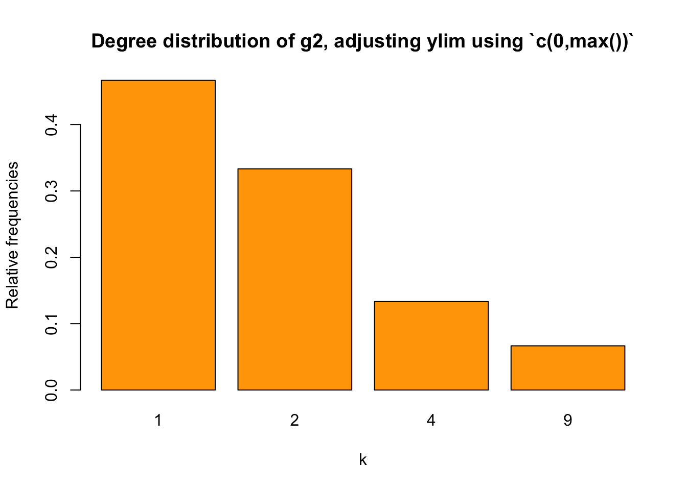
The Y-axis scale is still too short.
We may use max(t2/sum(t2))+0.1. It of course will be fine here, setting the Y-axis scale to be \([0,0.5]\):
barplot(relafreq_2, xlab="k", ylab = "Relative frequencies",
        main="Degree distribution of g2, adjusting ylim using `c(0,max()+0.1)`",
        col = "orange",
        ylim = c(0, max(relafreq_2+0.1)))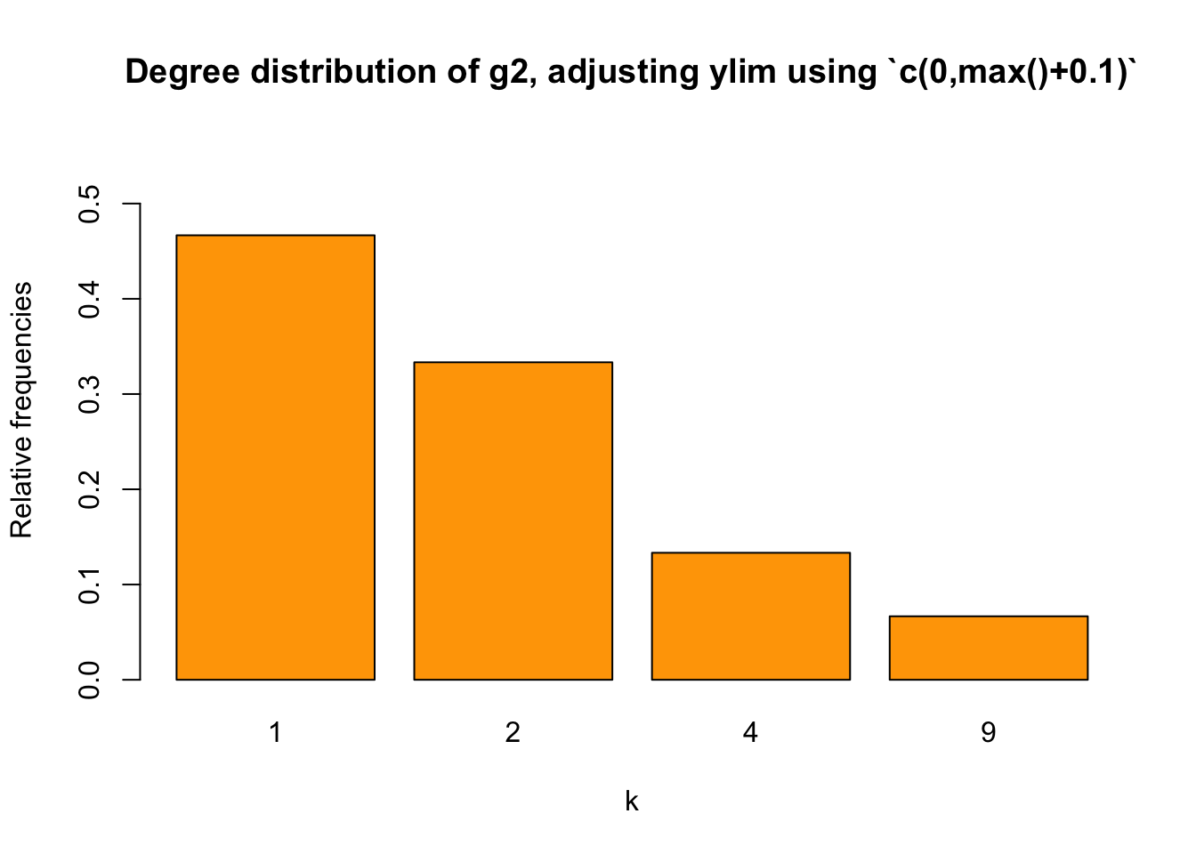
However, this method may not be applicable to other situations. Is there a better way? Yes, let’s try the pretty() function mentioned above. Read here and here to understand this function.
Basically, pretty() function will return a sequence of values that are equally spaced and cover the minimum and maximum values of our input. For example:
a <- c(0,1,2,3,0.5,1.2,0.001)
pretty(a)
## [1] 0.0 0.5 1.0 1.5 2.0 2.5 3.0c <- 0.1:0.5
pretty(c)## [1] 0.0 0.1d<- 0:10
pretty(d)## [1] 0 2 4 6 8 10Be aware that pretty() won’t be able to process a list:
b <- list(0,1,2,3,0.5,1.2, 0.001)
pretty(b)
# There will be an error:
# Error in min(x) : invalid 'type' (list) of argument
Then, what will happen if we use pretty(t2/sum(t2))?
pretty(t2/sum(t2))## [1] 0.0 0.1 0.2 0.3 0.4 0.5It works, right? However, for ylim, we need a min and max. How to get them? We can use the range() function, which will return a vector that contains the min and max of our input.
barplot(relafreq_2, xlab="k", ylab = "Relative frequencies",
        main="Degree distribution of g2, adjusting ylim using `range(pretty())`",
        col = "orange",
        ylim = range(pretty(c(0,relafreq_2))))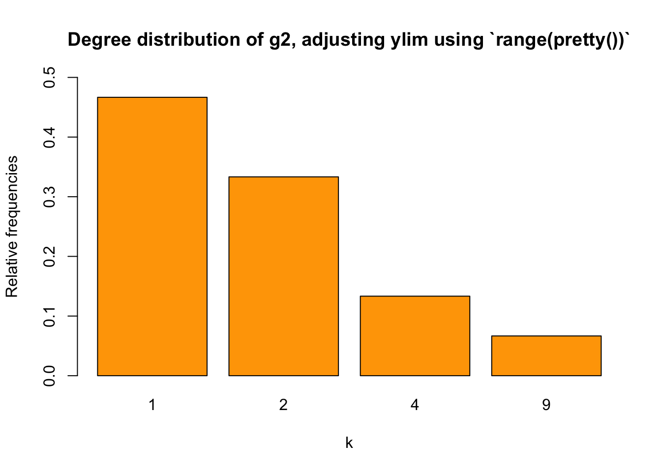
Some of you may wonder, why couldn’t we just use range(pretty(relafreq_2)). Well, we could. The thing is, if all degrees appeare at least once, then using range(pretty(relafreq_2)) rather than range(pretty(c(0,relafreq_2))) means that the start of ylim won’t be \(0\), I guess. So it’s safer to use range(pretty(c(0,relafreq_2))).
Going back to histogram
In the igraph tutorial by Dr. Katya Ognyanova, I saw that she showed the node degrees using histograms.
On second thought, I realized it’s not necessarily a bad idea to show node degrees via a histogram. After all, when the size of the network is huge and the node degrees vary greatly, a histogram isn’t that much different from a bar plot.
Why do I say that they are not that different? I’ll explain it using an example of a random graph.
set.seed(1234)
random_graph <- sample_gnp(1000, 1/1000, directed = FALSE, loops = FALSE)
plot(random_graph,
     main = "Plotting random_graph") # It's not very pretty...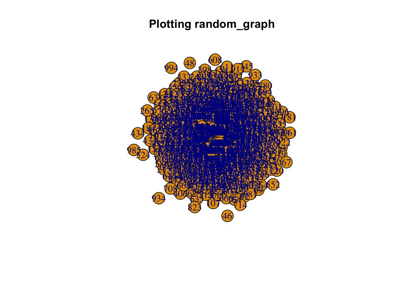
Figure 4: A random graph
Let’s draw its nodes degree
deg_random <- degree(random_graph)
hist(deg_random,
     main = "Hist of nodes degree for rnd_g, without adjustments",
     xlab = "k",
     col = "skyblue")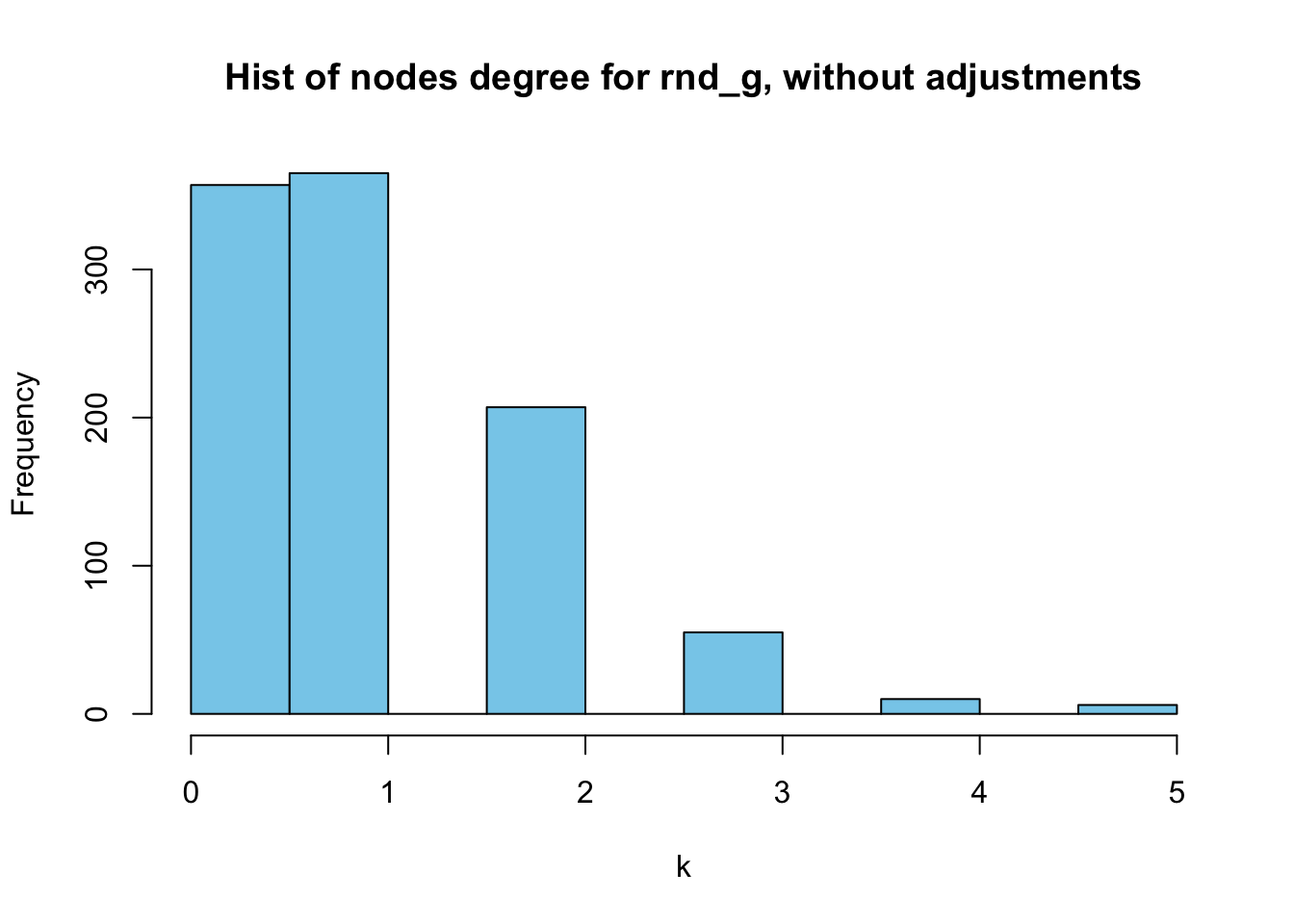
Figure 5: Histogram of random_graph’s nodes degrees, without adjustments
Then, let’s compare the above histogram with the corresponding bar chart:
t_random <- table(deg_random)
relafreq_random <- t_random/sum(t_random)
barplot(relafreq_random, xlab = "k",
        ylab = "Relative frequencies",
        main = "Degree distribution of random_graph, with ylim adjusted",
        ylim = range(pretty(c(0,relafreq_random))),
        col = "orange")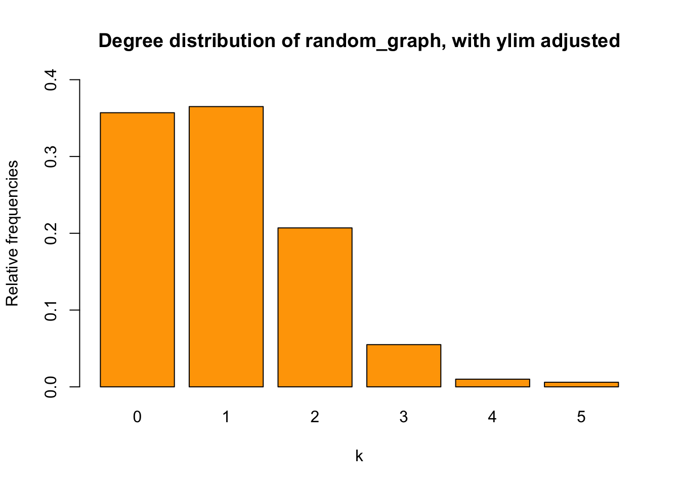
They are not that different, right? Except for the fact that the histogram captures the absolute frequencies whereas the bar chart displays relative ones.
Deciding on X-axis scale
When deciding on the X-axis scale of the histogram, Dr. Katya Ognyanova in one of her posts used vcount()-1. This worked in the example she provided but I don’t think it is the best option. For example, in the above random graph we have, there are \(1,000\) vertices, but the maximum degree is only \(5\). Therefore, we cannot use vcount()-1, which is \(999\) in our case, to denote the maximum on the X-axis:
max(deg_random)## [1] 5hist(deg_random, breaks = 0:vcount(random_graph)-1,
main = "Hist of nodes degree for rnd_g, using `vcount()-1`",
xlab = "k",
col = "skyblue",
ylim = range(pretty(c(0,table(deg_random))))
)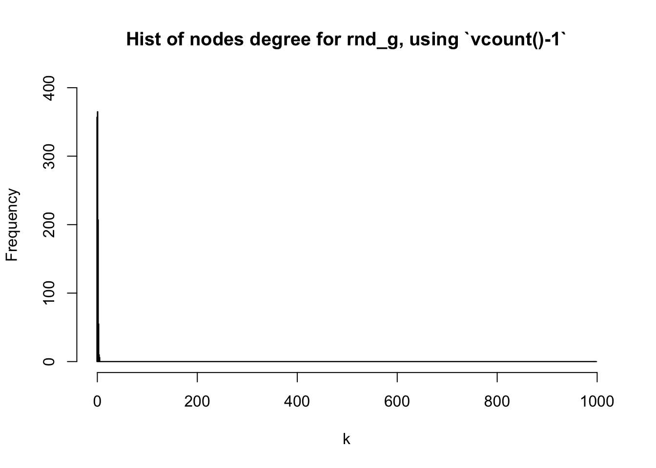
Figure 6: vcount()-1 doesn’t fit quite well here
As we can see above, the figure doesn’t show the nodes degrees in detail because the X-axis is too large. A better alternative might be max(degree(G))+1 where G is the graph you are interested in:
hist(deg_random, breaks = 0:(max(deg_random)+1),
     main = "Hist of nodes degree for rnd_g, adjusting breaks using `seq()`",
     xlab = "k",
     col = "skyblue"
     )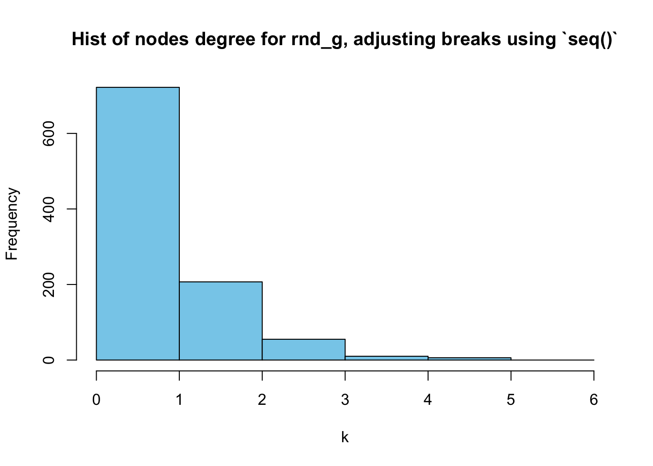
Adjusting a histogram’s breaks
As we can see above, the range of [0,1] shows the frequencies of \(k=0\) and \(k=1\) combined:
t_random## deg_random
## 0 1 2 3 4 5
## 357 365 207 55 10 6This problem also occurs in Figure 5
How to solve this problem?
We can simply change the breaks. Set it as breaks = seq(0,(max(deg_random)+1), by=0.5) so that there [0,1] will be divided into two parts. I learned this trick from here.
hist(deg_random, breaks = seq(0,(max(deg_random)+1), by=0.5),
     main = "Hist of nodes degree for rnd_g, adjusting breaks using `seq()`",
     xlab = "k",
     col = "skyblue"
     )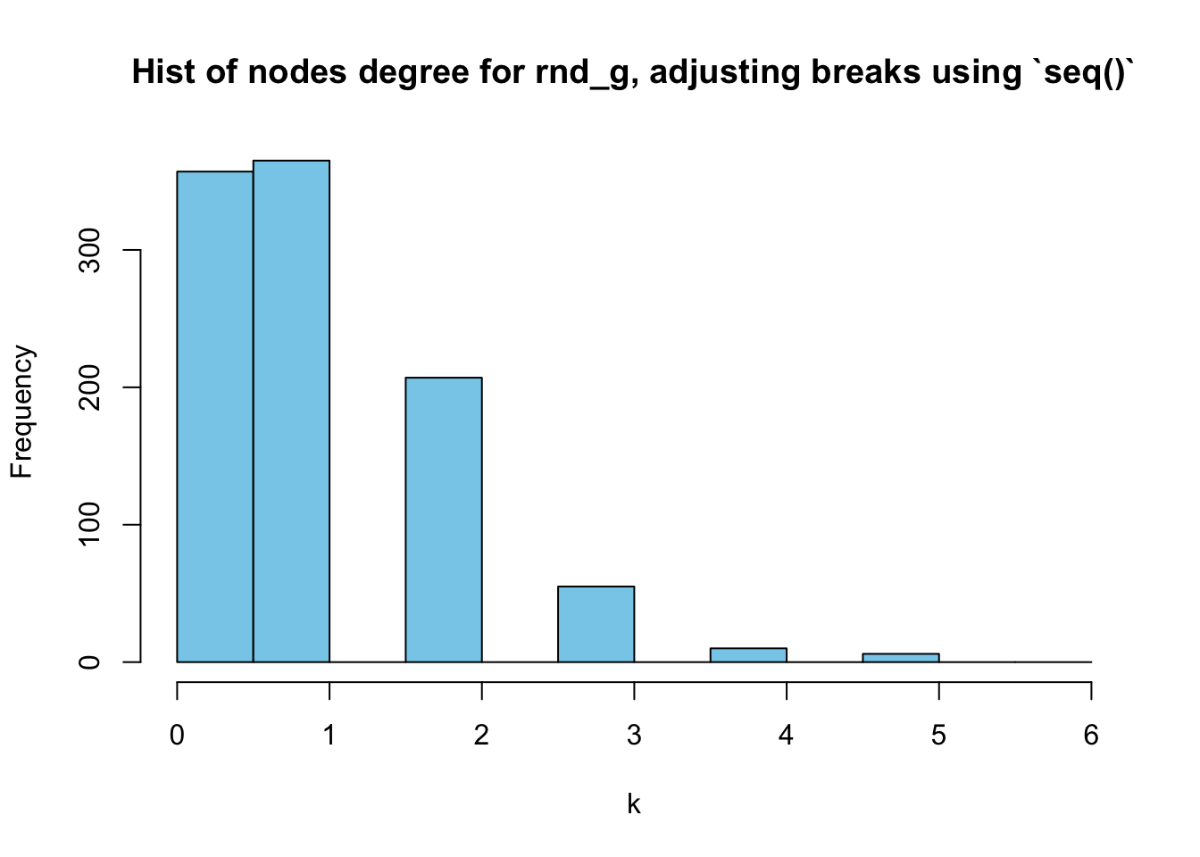
However, it’s still a little packed in \([0,1]\). Let’s try setting the start of the seq() to be \(-1\):
hist(deg_random, breaks = seq(-1,(max(deg_random)+1), by=0.5),
     main = "Hist of nodes degree for rnd_g, adjusting breaks using `seq()`",
     xlab = "k",
     col = "skyblue"
     )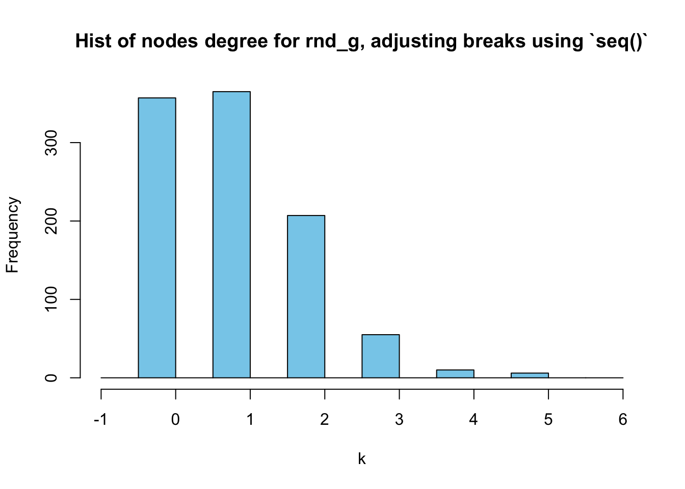
Now, it’s much clearer.
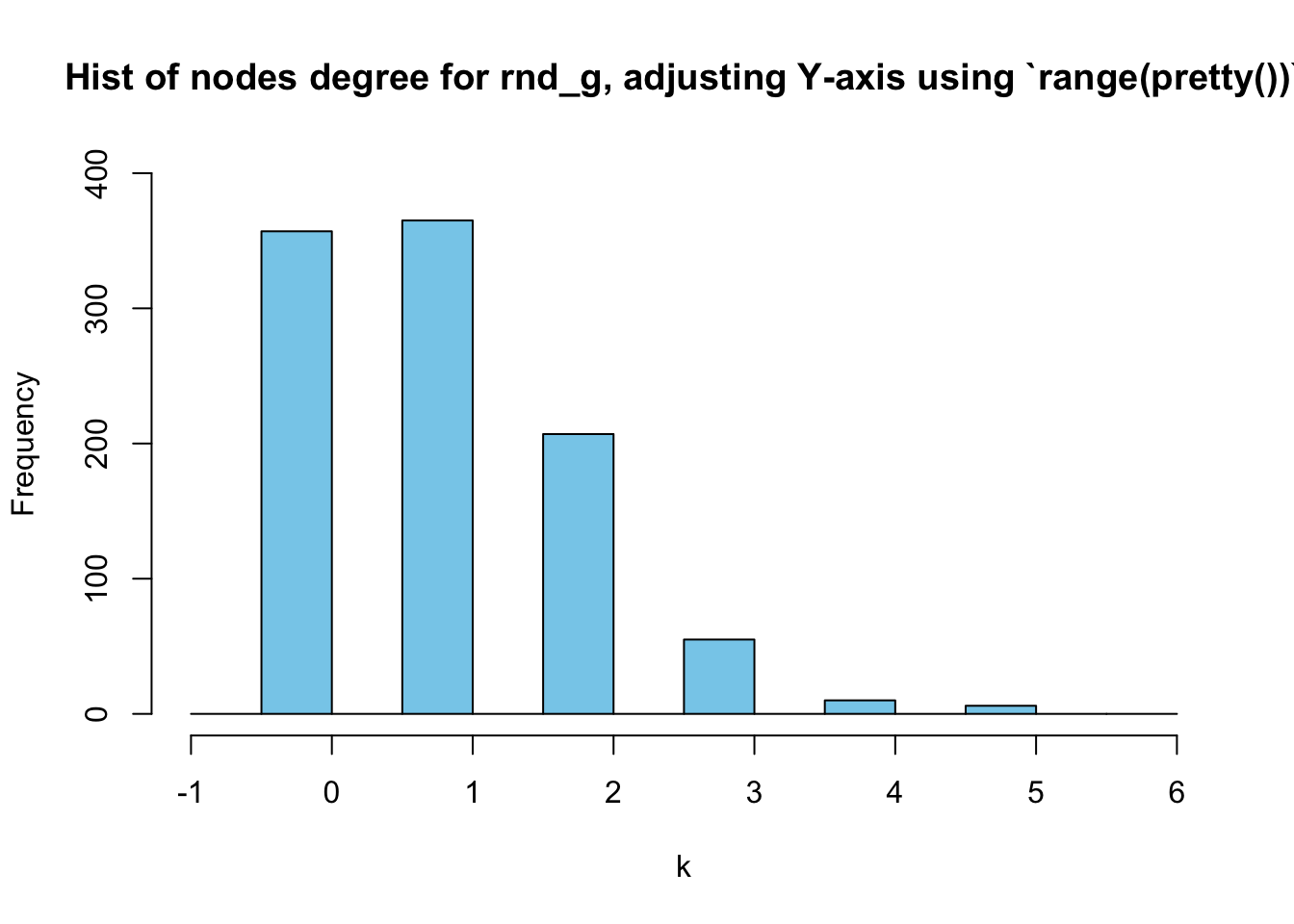
Adjusting a histogram’s Y-axis
In the above figures, the Y-axis scale is too short. How to solve this problem?
We can simply use the trick of range(pretty()) again here:
hist(deg_random, breaks = seq(-1,(max(deg_random)+1), by=0.5),
     main = "Hist of nodes degree for rnd_g, adjusting Y-axis using `range(pretty())`",
     xlab = "k",
     col = "skyblue",
     ylim = range(pretty(c(0,table(deg_random))))
     )
Conclusion
How to draw a bar chart to display a network’s degree distribution
For bar chart, the only problem we faced lies in the ylim. We simply need to use ylim = range(pretty())
How to draw a histogram to display a network’s nodes degrees
When drawing a histogram, we had three issues:
- Deciding on X-axis scale
- Breaks in X-axis
- Y-axis scale might be too short
To decide on the X-axis scale, we tried vcount()-1 but the result was not ideal. Then we used max(degree(G)), which is better.
The second problem is how to set the breaks. We first used breaks = 0:(max(G)+1) but it will show \(k=0\) and \(k=1\) combined, which is not what we want. Then, we tried breaks = seq(0,(max(deg_random)+1), by=0.5). It got better but was still not quite ideal. Then we set the start of the seq() to be \(1\) and the result was good enough.
The third issue is the short Y-axis scale. We solved the problem using range(pretty()).
Another option
Chengjun Wang defined the function plot_degree_distribution() and fit_power_law(), which I found to be very useful.
Last modified on 2021-10-07